These are:
Front pages
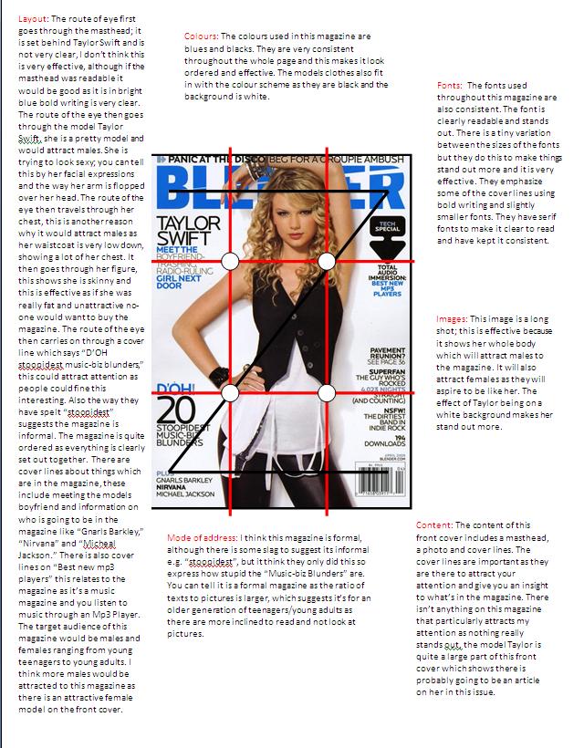
https://blogger.googleusercontent.com/img/b/R29vZ2xl/AVvXsEj8A1fHnMUsq4LpLkHuyn4vA1JO0WsFxvmb_aB6ELFmpg5dSAxO3HoqWoM4VxZXIhN6cGwXrapJBaaVpSWSflWnrkFBuwKHmVEWTQTSTxPVP3FaQL7zBUe5e41GDwSo7R-cjCrW19eq-Xc/s1600/Anaylsis+of+front+cover+1.JPG
https://blogger.googleusercontent.com/img/b/R29vZ2xl/AVvXsEi00Emy-De1y5Gf_1-3UehSk6-OYgJC3XH3aUL9qCwT396I1g_CNt4WlIdIqY1_attKdtLVvpxhjXM0YqRv4L2qj-lwCrqelQnAoBpAyjOZBoxAJf8cQjzWQNZnVU9RNoHXk_mCos08rso/s1600/Anyalis+s2.jpg
https://blogger.googleusercontent.com/img/b/R29vZ2xl/AVvXsEhDzpwmbTG-KrUnHu134i2gPrUCorVX_rAEODMnPwAJPFa2gzzVPvlQujcfCcPAFIUTdwesF9wumvelAK_tKDkpDJeD5g5HzabcKmUu9fMHOkI9RvS0GmS-6_5GFEI3OFB91JQP7mkwhEQ/s1600/Anaysis+3.jpg
Contents pages
https://blogger.googleusercontent.com/img/b/R29vZ2xl/AVvXsEiNkUALIvJc5x1U5YRjMJowUW6tsq1vNhRxt1muIg__VKm1B3yAVON52m-orTWC67KtmoXHY3bnwSlu72JbCBMd7WQZDfL5n4SG9IiYqEDZMVi6xXMSVRIBOMsBrZYkYf8WYfT3T92WLI4/s1600/Contents+page+1+part+1.jpg and
https://blogger.googleusercontent.com/img/b/R29vZ2xl/AVvXsEjiTe_4XyrTQ9opCUPAlZweTa4Kk-b8-tpYGmdV2F2wqLi7WxLQOfkXNNimBH7I4I7AT1T89I-I9VOUvhhKzwkKcp4VUPHlx0NXHO2Fb21952W7bN-wHyaTLDTnQvb4jLZrD48TrCkyM0U/s1600/conetnets+page+1+part+2.jpg
https://blogger.googleusercontent.com/img/b/R29vZ2xl/AVvXsEjNHSjbsgKBqfbY2INjEd5OQgEviiBf7gtQqzhC7gys0umsxv4y1cFysMo6A8MlQPnwiu6EbA8c9O6iPZ72P4aQo-RHBI_OfAn_51WzlPB4IJ7r1JCPOuV1IlgfZWMNJxD8XCo-5z2x1BQ/s1600/contents+3.JPG
https://blogger.googleusercontent.com/img/b/R29vZ2xl/AVvXsEiEvx0HW_Rxak_akETTY-h7KV5UYI2fV2yw0ruyeaSS3Mcoc95xgGCT1LSvfEFr4zC6uMiSi7TJNyOyinnYtpddoUfVFdbHcCIxxVZaY8yUYStrPv4s7oGwrHPa_4a-6fsIYfa7Hw4h1VQ/s1600/Contents+2.JPG and https://blogger.googleusercontent.com/img/b/R29vZ2xl/AVvXsEgMyI0DoaB-gt9Vw01pZLOgI3wt6yIR5O76rrvF-gHYqZ-MFbmMyIiep-oHIGpW4XQjky0bnzyG9Mw-slJTKTVlqHAfZ1lLN7iWngXWpV2c1sJv-pzRKs63kz0nSmEdl4TNb8OOAivdu4c/s1600/conetnts+2+part+2.JPG
Double page spread:
https://blogger.googleusercontent.com/img/b/R29vZ2xl/AVvXsEgAD189pj9pLYvD9poA8e-yrVmXsQtHek9JGWh4blyOlPU8J2Dv6esSHEXK2D7JlsEMnHPG84txlRtBwahzdXnGHyTsfv7qFCEmJ8A-4Y-hGnvDjtxh8yL8j7m8e_wzElNuTmcGGdHNDas/s1600/font+page+3.JPG
https://blogger.googleusercontent.com/img/b/R29vZ2xl/AVvXsEgf_M5xpPP6CjZPQyX08sc5hiq-wxZp1FT9wZAxiCif658KoGe1Rtfp_oewJ3VCQ3egwM8KgwB8RUYJgmLuT-qOqCTdMwF2g_BSBhY5LM-EEFtKsLqgJO2qS47FWK46mW7J7OEvgRM2sBE/s1600/Front+page+2.bmp and https://blogger.googleusercontent.com/img/b/R29vZ2xl/AVvXsEiVlsf6OCt4clY2eFBRy4axg0cKnMR1YaM023hzN18kU1YzD4Bce3jUpsIIPBClJlmgB-OSfeUuCZ9iMkY1MtXH2KB6Hte2Ch8eWL20bQg6CDdbFzNmhX1kJAz9xjOq13bQ514gynAHJpI/s1600/contents+2.bmp
https://blogger.googleusercontent.com/img/b/R29vZ2xl/AVvXsEhkdYiqfY5NCPNlFghfUTw0FbI_GjD_zttejJavXYJmmCbVovGGFhb-K9iOhmSpJuOLeXftra-Vnzucs5rOW4VCuzVr2isDd1ePyCN5EnAPh2T8A9Aurf9zMbOrSygRdHnPa-NoU7i5VDQ/s1600/double+page+spread.jpg and https://blogger.googleusercontent.com/img/b/R29vZ2xl/AVvXsEj88TYyIKe2i-qFCiDG1DxMNL1Z_3jRcaCDF_7N1NuCBruYsF-gRGEs4DfEgjQ_GPFv2jBN99WhfUsxGDS9l4lrIeHIKoq9-P7_Qz9ljV-cR6DS-wVaBwp8uLAduFy7MYHIxvzg7cenvno/s1600/double+page+spread.jpg++++gs.jpg
By doing this i found out which were the conventions which were most popular in each magazines. These are:
Front page:
-Masthead
-Large pictures
-Consistent colour schemes
-Consistent fonts
-Emphasis and larger fonts on things which are more important
-Cover lines of things included into the magazine
-Formal language
-Price , date and barcode, issue number.
You can see i have included these into my front pages.(Refer to bottom picture) I followed conventions becuase i felt that's what makes magazines sell. My image is different to ones i have seen before in other magazines. When doing my survey i found out that women were most wanted on the front of magazine covers. As my genre is R&B i felt that this shot is appropiate as you can see her tatoo on her back and i think this relates to my R&B genre. My pictures have been cut out from the backgroud and edited, which is also a convention of most magazine covers.

-Masthead
-Page numbers
-Descriptions
-Things in coloums
-Various little pictures and relation to articles
-Colour schemes and fonts consistent to front pages
-Abbreviations sometimes used.
I have included most of these on my contents page. (refer to picture below.) I didn't want to have loads of writing on my contents page so i decided to do three main highlights of what's in the magazine I then included a "also in this issue" sections because when styding magazines before this feature was included often. I also included a picture of my front cover on the contents page because I'd also seen this done before. My images are fitting into conventions as i have cropped the backgroud out and edited them. I have included props like a guitar and alochol because it relates to my articles.

The conventions of a double page spread are;
-Main pictures and other little ones
-Masthead and cover lines underneath
-Page numbers
-Descriptions
-Colour schemes
-Larger writing at the beginning of an article introducing
-Set out in coloums/paragraphs.
When making my double page spread i used most of the conventions above. (see below pic) I tried doing lots of things with my double page spread to see what worked best. I decided it was best to put the main picture seperate to the text, and the little ones just featured inside the text. I also added a larger caption as something was said in the interview which was important and a line which i thought would attract the audience. My images fit conventions as my genre was R&B i used props to make my pictures more effective. E.g Glasses, high top trainers, gillet ect. I also followed conventions by cutting the pictures away from their background. The reason why i had to add blue into my colour scheme when doing my double page spread was because the black was hard to see underneath the pictures.

No comments:
Post a Comment