Friday 8 April 2011

Evaluation - Appeal to target audiences.

My target audience was mostly females ages 16-21, but some males aswell. I used articles, colours, fonts, pictures to help capture the target audeince i wanted too.

Below is an example of my front cover, I have tried to capture my female/male audience mostly by using reds, blacks and whites for the colour scheme because that it unisex. Because my magazine is mostly for the female audience i have used a female model, because i feel females would see it and aspire to be like her. Therefore they would by the magazine because they think they will look like the model. I have also used more girly articles like "brit awards backstage goss" and "gorgeous Kelly". Although i have tired to target the male audience by using articles such as "win tickets to see electric blue." I feel males would also like the main image on my front cover because they would probably feel by model is good looking.

Above is an example of my middle pages, and how i feel i have captured my target audience by producing them. Purple is a femine colour so this appeals to my target audience of mostly females. Also the actually article is more for the females because it's interviewing a female singer, which girls will be intrested in. Also the font i used to write "Chelsea - i love posing for Musique" is more of a female font. My images are of a female model which women will like because they aspire to be like them. 


My contents page captures my target audience of males/females by using the unisex colours of red and black. But it captures more of my female audience by using femine fonts, "regulars" and "this week in Musique". Another way of capturing the female audience is the articles i have included "beautiful duo Phoneix hit the bottle" and "cheryl cole" and articles like that.


I produced a questionairre asking questions about what people thought of my magazine, below i will show my responses. I did not recieve as many responses as i would have liked. 


Evaluation - Technologies continued.

When creating my magazine, i used microsoft publisher to create my front page, contents page and double page spread. Firstly i created drafts, although i did them in word. Publisher is good for easily moving around things, so i created many different ones untill i decided it looked best. The one i changed most was my contents page, so I'll show an example below.

Draft of contents:  https://blogger.googleusercontent.com/img/b/R29vZ2xl/AVvXsEjKuNIK1ic8Di2y6r7vQ9pLkLxZEVjQq6NdE2HCIW8w4uG8lH6ZhUCHZmtbRHr80nR1IkOVcaiRqNErYlsWaDnrE_wSMhd76D304CiVyZ0s4l38iMzspvAfzYWbNmeUA7dSMZUFWZjitE8/s1600/contents+page+layout.JPG 

Draft 2 of contents  https://blogger.googleusercontent.com/img/b/R29vZ2xl/AVvXsEjeHSl_XQTUTRRUyAXkv425azBrchd9fhTMCxWDMzAfJQXYV4zSwHhnx-SQn_1kyaZKkMal1xuQklWRhEXPU8PK-bSryZ3Ot2QVTFMjocOA3LIorYaYkyLTtCoriUPBtQqcFemlT4d5YeU/s1600/contents.bmp

Draft 3 of contents https://blogger.googleusercontent.com/img/b/R29vZ2xl/AVvXsEjTDbl_UJxJv8o3VyXXtDknSSXBH2rvY1nBe2Gzb0SZ-kfVFhSGRoGifjxKrA7XlLWu5HCdWNh02k8ChyqOTco8eHehiAbMBi-1eKJczSlOg9fVMG74CyHtkK-yXJqnjeOqJ5KVonYUzYY/s1600/cotnets.jpg   

Completed contents pages  https://blogger.googleusercontent.com/img/b/R29vZ2xl/AVvXsEjMNW4wDkGarkggarDe5cIQviVXAovuChrE_R0PDAIpMBKLKHsNhsQ3c7d5y0JnYHjx1sHMamJNMD_N9fUbobuaNlJ3vLSdPHoDxINGYbBPatEk2wEfZpu4Zm1mCKJzqufmAl05-UH2Xqo/s1600/contente+nws.jpg


These show how i have progressed and used my skills in publisher to change and re create a new contents page. 

Thursday 7 April 2011

Evaluation - Technologies

Whilst producing my my magazine, used different types of technology Examples of these being a camera, word, publisher, fireworks etc. Whilst progressing through my magazine i feel i have created a more proffesional looking magazine, as i have had more expierence of working with the programmes.
I took my photos using a digital camera, meaning i was able to get a variety of distances and shot types. I took many pictures but didnt use them all. I took the photos around in my house, then edited them and cropped the background out making them look more professional.
I edited my photo's on macromedia fireworks, enabiling me to fit them confortably on the background. Examples of this are shown below. This shows how i started of with a images with a background, edited it and took the background out, then fitted it onto my front cover.


 Macromedia fireworks was easy enough for me to work with and remove the background from the image. I used new tools to develop my skills, firstly using the lasso tool to remove the majority of the background, then the rubber to remove the rest closer to the edges. Below is a print screen of me using macromedia fireworks, and the image before i edited it.


Completed magazine


Tuesday 5 April 2011

Evaluation - Representation.

My product consists mostly of the social group of young girls. Girls can be represented in different ways, depending on the genre. As my genre is R&B my females need to be shown as being quite rebelious, chavvy and different. I have tried to show a act of rebilion through my first image, by having my model naked. Although you can only see her back, you know she hasn't got any clothes so i feel it creates this act of rebilion needed. Also the fact she has a tatoo down her back and you know she's young, also creates the feel of she's doing something she shouldn't be. I cropped out the backgrounds as i feel this is conventional and helps create more attention on the model, showing them how i feel they should be shown. This is my main image.

These are my middle page spread images:

 I feel in these images i have shown my model as the "chavvy" girl i wanted to, by using trainers and the glasses.  But i feel in all of my images i have shown my models to be quite natural, with miminal make up and hair do's and just casual clothes. My reasons for doing this is because my target audience is young females, i wanted them to be able to relate to the women, and not feel they have to try hard to be like the girls, like in many female magazines. Therefore the audeince will find it easier to relate to her because she's more like them.  Even though the clothes, hair and make - up are quite miminal, my model is seen as having her own personal style, I.e wearing the trainers and glasses.


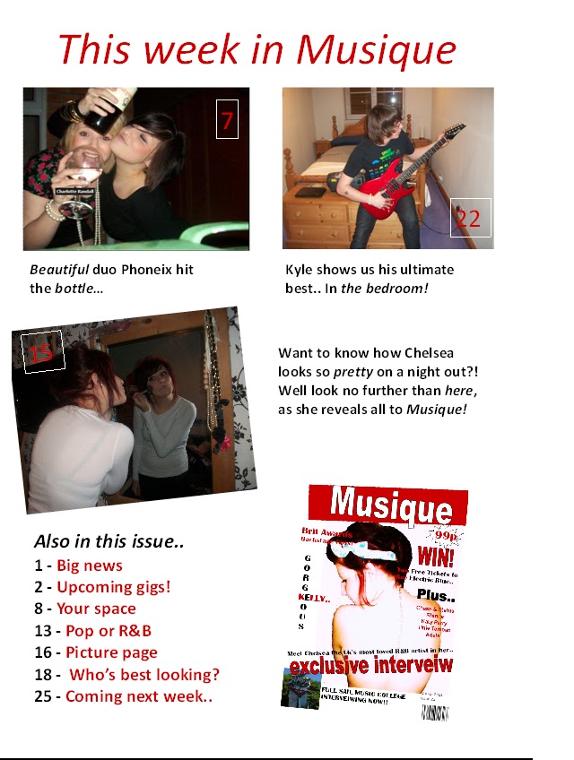
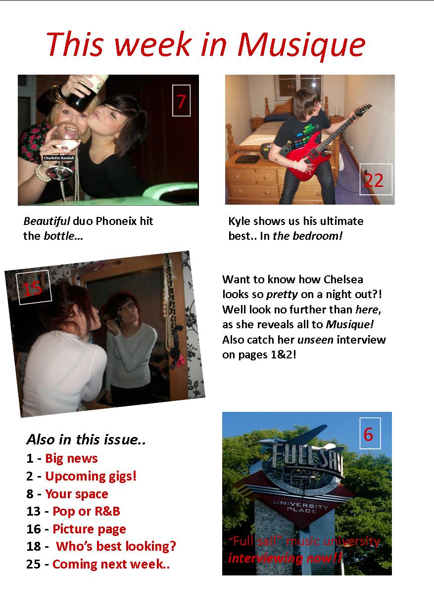
My contents page images have the same feel about them, but i also have included a photo of a male. I have used a image of my model doing her make-up in a mirror, and you can see she is just in a general room. My reasons for using this image is because it shows that even though she's famous she can do her make-up her self. This also gives the feel that the readers can relate to the model, and not feel like they can't create their make-up like hers because she has had it done proffesionally, because this images shows her doing it herself. Another image i have shown is two females drinking alochol. My reasons for doing this is because the article was about them hitting the bottle, but also to create the act of rebelion again. You can see by this image that they are wearing jewrelly which shows they are more dressed up than the other models, showing them to have their own personal style. My last image is simply just of a male playing a guitair, again he is wearing casual clothes, consisting of a space invaders top and jeans. Which i feel shows him being casual so that the audience feels that they can relate to him. My images are shown below.


When comparing my images to a magazine similar to mine (Vibe.)
You can see straight away that their image is more sexual, the model is more made up than i wanted mine to be. This makes mine look unconventional but there are reasons why mine isn't the same. The main reason for this because we have a different target audeince. I wanted females to be able to immediatley relate to my magazine, and not feel like they had to try hard to be like them. Whereas in Vibe, the model is clearly wearing lots of make-up, has had her hair done, been fake tanned ect.  


Language:
As my target audeince was young males to females ages 16-21, but moslty towards the female side, i felt i should use young fresh language. I tried to use quotes which are sterotypical like "Just stick to it, don't give up, you should always believe in yourself" and "brit awards backstage goss." My reasons for using these are i feel they relate to my young audience, e.g if a reader was trying to become artist and felt they couldn't make it they would be aspired by someone they look up to telling them not to give up. I also used a quote "Kyle shows us his ulimate best.. in the bedroom" My reasons for doing this is because it makes it seem to be something sexual which would attract people to read it. When really it's just him playing the guitar in the bedroom. In my double page spread i used more formal language because i felt it needed to be.

Saturday 26 March 2011

Evaluation - Progression from preliminary task.

I  feel i have progressed scince my preliminary task. Underneath shows images of my preliminary task and my main task.

I feel i have progressed from my preliminary task well. My skills have developed before from before, in my preliminary task i had to take a picture of my image against a white background because i was unable to remove a picture from a background, but now i can and have proved this throughout my magazine. My images are also now more to do witth the genre of the magazine, and i have thought about shot types etc. I have improved also on the layout of my magazine, some of the captions on my prelimiary task look out of place like they shoudnt be there, but on my main task they look more like they belong there. 

I also feel like I've made better use of the space, instead of just writing a few things I've included more captions of things included in the magazine. Ive also included a bar code, issue numbers and a price which i didn't do on the preliminary task. Also my preliminary task looked as if it was more for females, but i feel my main task can attract both audiences.

Evaluation - Insitutions.

A company called Intermedia partners produce magazines like mine. I think they're the type of company who would produce a magazine like mine as they have a similar one. This magazine is called Vibe, and i anaylised it when doing my research and planning.(https://blogger.googleusercontent.com/img/b/R29vZ2xl/AVvXsEi00Emy-De1y5Gf_1-3UehSk6-OYgJC3XH3aUL9qCwT396I1g_CNt4WlIdIqY1_attKdtLVvpxhjXM0YqRv4L2qj-lwCrqelQnAoBpAyjOZBoxAJf8cQjzWQNZnVU9RNoHXk_mCos08rso/s1600/Anyalis+s2.jpg)  I found this out when i did my instutions research before doing my magazine. (http://charlotterandalll.blogspot.com/2010/11/audience-research.html).
They are a company who have invested into
-magazines
-cable teleivison
-broadcast television
-print programming and broadcasting.
One of the companies they hold is Vibe.Vibe is not only a magazine its a music channel and blog etc.

Here is an example of the front cover of Vibe and the front cover of my magazine, Musique.

Our magaines are similar in many different ways, Firstly both mine and Vibe have the same sort of main image, which is in the middle of the page. Secondly we both have a masthead and consistent colour schemes. The colour scheme in Vibe is red, white and blue, whereas in my magazine it's red, black and white. Both our magazines are unisex but the images would mostly attract a male audience. We both have lists of artist inlcuded in our magazines, and things which are more important in larger fonts. We have both included a price barcode and issue number.

Evaluation- Target audience

The target audience for my magazine are older teenagers to young adults.And mostly females. My reasons for this is because when i did my questionairre before producing my magazine they came up as most likley to read my magazine.

This is the example of my questionairre results.

Also when doing my questionaiire i asked whether males of females would read my magazine. It turned out that more females would read my magazine rather than males. Which meant that i should probably of put a male model on my front cover as thats what women like so see, but i decided I'd rather put a female on their as i could'nt get a male model to take pictures of. Females are still attracted to my magazine because they aspire to be like the women on the front.


 I knew that although my questionairre results proved that more women would read my magazine more than men, i knew men would to. Because of this i choose to use unisex colours of red, white, black and also decided that I'd add articles which women and men can relate too. When i did my audeince research into a magazine like mine, i choose vibe. See link..
http://charlotterandalll.blogspot.com/2010/11/audience-research.html 
I found that there target audience was around ages 12-24, which is a wider variety to mine but inluding the same ages. I think reasons for this is because most of the people who took my questionaiire were my school friends who are around the ages of 16 to 19.

Thursday 24 March 2011

Evaluation - conventions.

When i did my research into magazines and conventions i anaylised three front covers, three contents pages and three double page spreads.
These are:
Front pages
https://blogger.googleusercontent.com/img/b/R29vZ2xl/AVvXsEj8A1fHnMUsq4LpLkHuyn4vA1JO0WsFxvmb_aB6ELFmpg5dSAxO3HoqWoM4VxZXIhN6cGwXrapJBaaVpSWSflWnrkFBuwKHmVEWTQTSTxPVP3FaQL7zBUe5e41GDwSo7R-cjCrW19eq-Xc/s1600/Anaylsis+of+front+cover+1.JPG
https://blogger.googleusercontent.com/img/b/R29vZ2xl/AVvXsEi00Emy-De1y5Gf_1-3UehSk6-OYgJC3XH3aUL9qCwT396I1g_CNt4WlIdIqY1_attKdtLVvpxhjXM0YqRv4L2qj-lwCrqelQnAoBpAyjOZBoxAJf8cQjzWQNZnVU9RNoHXk_mCos08rso/s1600/Anyalis+s2.jpg
https://blogger.googleusercontent.com/img/b/R29vZ2xl/AVvXsEhDzpwmbTG-KrUnHu134i2gPrUCorVX_rAEODMnPwAJPFa2gzzVPvlQujcfCcPAFIUTdwesF9wumvelAK_tKDkpDJeD5g5HzabcKmUu9fMHOkI9RvS0GmS-6_5GFEI3OFB91JQP7mkwhEQ/s1600/Anaysis+3.jpg
Contents pages
https://blogger.googleusercontent.com/img/b/R29vZ2xl/AVvXsEiNkUALIvJc5x1U5YRjMJowUW6tsq1vNhRxt1muIg__VKm1B3yAVON52m-orTWC67KtmoXHY3bnwSlu72JbCBMd7WQZDfL5n4SG9IiYqEDZMVi6xXMSVRIBOMsBrZYkYf8WYfT3T92WLI4/s1600/Contents+page+1+part+1.jpg and
https://blogger.googleusercontent.com/img/b/R29vZ2xl/AVvXsEjiTe_4XyrTQ9opCUPAlZweTa4Kk-b8-tpYGmdV2F2wqLi7WxLQOfkXNNimBH7I4I7AT1T89I-I9VOUvhhKzwkKcp4VUPHlx0NXHO2Fb21952W7bN-wHyaTLDTnQvb4jLZrD48TrCkyM0U/s1600/conetnets+page+1+part+2.jpg
https://blogger.googleusercontent.com/img/b/R29vZ2xl/AVvXsEjNHSjbsgKBqfbY2INjEd5OQgEviiBf7gtQqzhC7gys0umsxv4y1cFysMo6A8MlQPnwiu6EbA8c9O6iPZ72P4aQo-RHBI_OfAn_51WzlPB4IJ7r1JCPOuV1IlgfZWMNJxD8XCo-5z2x1BQ/s1600/contents+3.JPG
https://blogger.googleusercontent.com/img/b/R29vZ2xl/AVvXsEiEvx0HW_Rxak_akETTY-h7KV5UYI2fV2yw0ruyeaSS3Mcoc95xgGCT1LSvfEFr4zC6uMiSi7TJNyOyinnYtpddoUfVFdbHcCIxxVZaY8yUYStrPv4s7oGwrHPa_4a-6fsIYfa7Hw4h1VQ/s1600/Contents+2.JPG and https://blogger.googleusercontent.com/img/b/R29vZ2xl/AVvXsEgMyI0DoaB-gt9Vw01pZLOgI3wt6yIR5O76rrvF-gHYqZ-MFbmMyIiep-oHIGpW4XQjky0bnzyG9Mw-slJTKTVlqHAfZ1lLN7iWngXWpV2c1sJv-pzRKs63kz0nSmEdl4TNb8OOAivdu4c/s1600/conetnts+2+part+2.JPG

Double page spread:
https://blogger.googleusercontent.com/img/b/R29vZ2xl/AVvXsEgAD189pj9pLYvD9poA8e-yrVmXsQtHek9JGWh4blyOlPU8J2Dv6esSHEXK2D7JlsEMnHPG84txlRtBwahzdXnGHyTsfv7qFCEmJ8A-4Y-hGnvDjtxh8yL8j7m8e_wzElNuTmcGGdHNDas/s1600/font+page+3.JPG
https://blogger.googleusercontent.com/img/b/R29vZ2xl/AVvXsEgf_M5xpPP6CjZPQyX08sc5hiq-wxZp1FT9wZAxiCif658KoGe1Rtfp_oewJ3VCQ3egwM8KgwB8RUYJgmLuT-qOqCTdMwF2g_BSBhY5LM-EEFtKsLqgJO2qS47FWK46mW7J7OEvgRM2sBE/s1600/Front+page+2.bmp and https://blogger.googleusercontent.com/img/b/R29vZ2xl/AVvXsEiVlsf6OCt4clY2eFBRy4axg0cKnMR1YaM023hzN18kU1YzD4Bce3jUpsIIPBClJlmgB-OSfeUuCZ9iMkY1MtXH2KB6Hte2Ch8eWL20bQg6CDdbFzNmhX1kJAz9xjOq13bQ514gynAHJpI/s1600/contents+2.bmp
https://blogger.googleusercontent.com/img/b/R29vZ2xl/AVvXsEhkdYiqfY5NCPNlFghfUTw0FbI_GjD_zttejJavXYJmmCbVovGGFhb-K9iOhmSpJuOLeXftra-Vnzucs5rOW4VCuzVr2isDd1ePyCN5EnAPh2T8A9Aurf9zMbOrSygRdHnPa-NoU7i5VDQ/s1600/double+page+spread.jpg and https://blogger.googleusercontent.com/img/b/R29vZ2xl/AVvXsEj88TYyIKe2i-qFCiDG1DxMNL1Z_3jRcaCDF_7N1NuCBruYsF-gRGEs4DfEgjQ_GPFv2jBN99WhfUsxGDS9l4lrIeHIKoq9-P7_Qz9ljV-cR6DS-wVaBwp8uLAduFy7MYHIxvzg7cenvno/s1600/double+page+spread.jpg++++gs.jpg

By doing this i found out which were the conventions which were most popular in each magazines. These are:
Front page:
-Masthead
-Large pictures
-Consistent colour schemes
-Consistent fonts
-Emphasis and larger fonts on things which are more important
-Cover lines of things included into the magazine
-Formal language
-Price , date and barcode, issue number. 

You can see i have included these into my front pages.(Refer to bottom picture) I followed conventions becuase i felt that's what makes magazines sell. My image is different to ones i have seen before in other magazines. When doing my survey i found out that women were most wanted on the front of magazine covers. As my genre is R&B i felt that this shot is appropiate as you can see her tatoo on her back and i think this relates to my R&B genre. My pictures have been cut out from the backgroud and edited, which is also a convention of most magazine covers.


Conventions of the contents pages are:
-Masthead
-Page numbers
-Descriptions
-Things in coloums
-Various little pictures and relation to articles
-Colour schemes and fonts consistent to front pages
-Abbreviations sometimes used. 


I have included most of these on my contents page. (refer to picture below.) I didn't want to have loads of writing on my contents page so i decided to do three main highlights of what's in the magazine I then included a "also in this issue" sections because when styding magazines before this feature was included often. I also included a picture of my front cover on the contents page because I'd also seen this done before. My images are fitting into conventions as i have cropped the backgroud out and edited them. I have included props like a guitar and alochol because it relates to my articles.


The conventions of a double page spread are;
 -Main pictures and other little ones
-Masthead and cover lines underneath
-Page numbers
-Descriptions
-Colour schemes
-Larger writing at the beginning of an article introducing
-Set out in coloums/paragraphs.

When making my double page spread i used most of the conventions above. (see below pic) I tried doing lots of things with my double page spread to see what worked best. I decided it was best to put the main picture seperate to the text, and the little ones just featured inside the text. I also added a larger caption as something was said in the interview which was important and a line which i thought would attract the audience. My images fit conventions as my genre was R&B i used props to make my pictures more effective. E.g Glasses, high top trainers, gillet ect. I also followed conventions by cutting the pictures away from their background. The reason why i had to add blue into my colour scheme when doing my double page spread was because the black was hard to see underneath the pictures.


edited contents page

Edited front page

Monday 7 March 2011

Magazine Survey

<div id="surveyMonkeyInfo"><div><script src="http://www.surveymonkey.com/jsEmbed.aspx?sm=ELXBtTzdMZ3B_2fnGq8CfwsQ_3d_3d"> </script></div>Create your <a href="http://www.surveymonkey.com/%22%3Efree online surveys</a> with SurveyMonkey, the world's leading questionnaire tool.</div>

Monday 21 February 2011

Mr Hibert..

I have a problem opening my files to complete my front page, i have finished it just needed to upload the picture onto it as i showed you at school.. but i will try again to open it on my brothers computer as he has alot more programs, sorry.

Monday 17 January 2011

Level 4 critera.

I think i will be able to achieve level 4 for my magazine if i put lots of work into it, I want to use different images completely at different angles and on different backgrounds etc. I want to use women in my magazine mostly because thats what i found out works best. I havent thought about what to put for my mise-en-scene yet but i want alot of text on my page and no blank spaces. I want to use formal language because my magazine is for an older more mature audience. I think my layout does follow convention, but there are many different conventional layouts which work well. I am going to use 1 or 2 fonts throughout and just put emphasis on it or make it larger if i want them to stand out because i realised after doing my questionaire that worked best.

Level 4 criteria

To achieve a level 4 for the print brief you would need to:

·        Excellent evidence in the creative use of the following skills;
·        Framing a shot, including and excluding elements as appropriate
·        Varieties of shots used, including distances
·        Pictures appropriate to the task set
·        Mise-en-scene selecting, including colour, figure, lighting, objects and setting.
·        Manipulating photographs as appropriate to the context for presentation, including cropping and re-sizing.
·        Language and register used in a accurate way
·        Appropriate integrating illustration and text
·        Understanding shown of conventions of layout and page design
·        Awareness of the need for variety in fonts and text size
·        Using ICT appropriately

 Both these magazines are effective as they both completely filled with information and nothing is left blank. Both front covers have a clear image and a clear masthead. The contents pages are both very effective and clear and each section’s stand out. They both used consistent colour schemes and fonts. The photographs are appropriate to the genre of the magazine and appeal to the target audience. Both magazines are very well laid out and include lots of relevant information. The pictures manipulate the magazine and are related to the context, all of these things help the magazines to achieve a level 4.

They could have improved on having a more interesting background, and I think the first magazine could have had a better main image.